Friday, 8 May 2009

Wednesday, 6 May 2009
Images I decided not to use

I took this photo because I wanted to use it for my front page but it was only after taking a few horizontal shots that I remembered that for my front page the image had to be portrait, therefore, I was unable to use it.

The reason I have chosen not to use the image on the left is because the girls are looking rather moody which doesn't fit with the type of genre that my magazine is; because it is a pop magazine the girls should be happy and smily so as to appeal to young girls as their ideal self.
 The reason I have chosen not to use the image on the left is because the lighting is extremly bright and so doesn't look very realistic for a sleepover. Also we are unable to see one of the girls faces.

Evaluation
Evaluation
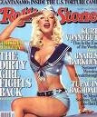
My magazine in some ways challenges other conventions of media products because it is unlike many music magazines and so I believe that there is a gap in the market for a magazine such as Pop it. Most music magazines such as Q or Kerrang that are available target 16+ year olds whereas Pop it challenges this and is specifically targeted at a younger audience. In order to make my magazine appear as realistic as possible, I realised that it did have to have certain conventions that other media products have, and so in order to get that across in my magazine, I regularly looked at other magazines such as Top of the Pops in order to discover what aspects and styles would work best in it.
My magazine is very stereotypical of young girls as I believe that this would be the most significant way to target my audience, for example, the colour pink connotates young girls, and so therefore by the majority of the colours I have used being pink and purple, it attracts my target audience. Also, by having a female group as the main feature band the audience would view them as role models and see them as their ideal self (Roger 1980)
I think an independent company would distribute my magazine due to it targeting a very niche market, most conglomerate companies would aim for higher circulation figures and a wider audience whereas Pop it, targets a smaller, more specific audience. In order to decide what price my magazine should be, I first decided how often the magazine would be distributed. Due to my audience being young, either their parents would be buying it them or they would be using some of their pocket money to purchase it so I realized that the price would have to be relatively low and be released every two weeks in order to keep readers buying the magazine. My magazine would be promoted on the television, on channels such as ITV 1 or channel 4 in the mornings or Nickelodeon as programmes aimed at children are on these channels. I think advertising it on television would be the most effective way to promote the magazine because they would see the magazine and it would draw the audience in. Children don’t often listen to the radio so I believe advertising it on the radio would be a waste of money.
The audience of my media product is young girls aged 7-14 who are ‘stereotypical girls’ meaning they are interested in things such as dressing up, television and going out with their friends. In order to relate to my audience, I have ensured that the magazine has a very chatty, friendly feel to it, and have deliberately incorporated what Bernstein calls restricted code as this age group would not understand complex lexis and it would therefore eliminate a large amount of my target audience. I showed my magazine to friends younger sisters in order to gain feedback and see what they thought of my magazine. The feedback was very positive and they said that yes they would use their pocket money to buy the magazine as it was girly and had the sort of music that they and their friends listen to. They especially liked the double page spread article and found it really interesting as the questions were chatty but made them learn more about the band. What appealed to them most was the fact that it was set at a sleepover which gave the element that the band were down to earth and therefore related to their fans.
I attracted my audience by using a girl band so that the audience would see them as their ideal self and want to be like them. Then by juxtapositioning images of male stars, it attracts the audience because they would see them as their ideal partners. Girls are attracted by boys and their looks, and that is why by incorporating images of male stars, it would increase the circulation figures. The house style is pink and purple as these are my audiences’ favourite colours and people would immediately realise the target audience as soon as they saw the magazine. I used the font arial because it is friendly and informal, just like my magazine. My mast head design is eye catching due to the purple circles with the pink writing. The reason that I decided to call my magazine Pop it is because it is a play on the word poppet, which children often get called when they are young, it also informs the reader of what kind of genre the magazine is. It is short and snappy which would help readers to remember the name and what it is about. The style of the text is peer to peer (it talks to the audience as if they were a friend), I think this is further exaggerated in the contents page where I introduce the magazine as informal lexis such as ‘hiya’ has been used. It is also exaggerated in the double page spread as my aim was to make the reader feel as if they are involved at the sleepover.
I believe I am not the strongest person when it comes to technology and computers, so this project has been a real eye opener and has enabled me to broaden my usage of technology. I had never before used web 2.0 (blogs) but have found that it’s a really good way of allowing other people to view what your doing and give you constructive feedback on it. Before this project, I had never even heard of Photoshop before, but I have really enjoyed using it for my front and contents page. I have enjoyed being able to play around with different fonts for example, by increasing the different types of layers it creates an unusual affect. I also enjoyed manipulating images in order to make them more realistic, for example using the spot brush and airbrushing the band to make them look more star like. I would say my weakness was that I spent too much time on my drafts. I enjoyed using the Canon EOS camera to take photos for my magazine, I had never used a professional camera before which enabled me to get good quality images. I used Quark Express for my double page spread, which allowed me to view the double page spread as if it were a real double page spread for example having columns and adding images that fitted to the image box without them being stretched or looking out of place. I think my strength using Quark was inputting different fonts and using them in the correct places, whereas my weakness was actually setting it up as a double page, although I could quite easily insert the page, I found it hard moving the pages so that they were next to each other, but once this was done, I really enjoyed using Quark Express. I used Top of the Pops magazine as a style model as this targets the same audience as my magazine, however a problem that I found when using it as a style model is that it doesn't have a contents page (it uses its front page as this and places the page numbers on each image), I therefore found it hard to be able to see what the layout of my contents page should be, however I overcame this obstical by viewing other magazines and then encorprating my house style with my ideas which I believe gave me a realistic contents page.
Subscribe to:
Comments (Atom)
